Munich 1972 Posters : Sports Test Prints - Case Study
- M72C
- Sep 5, 2023
- 2 min read
Updated: Jun 27, 2025
[ M72CS : 001 ]
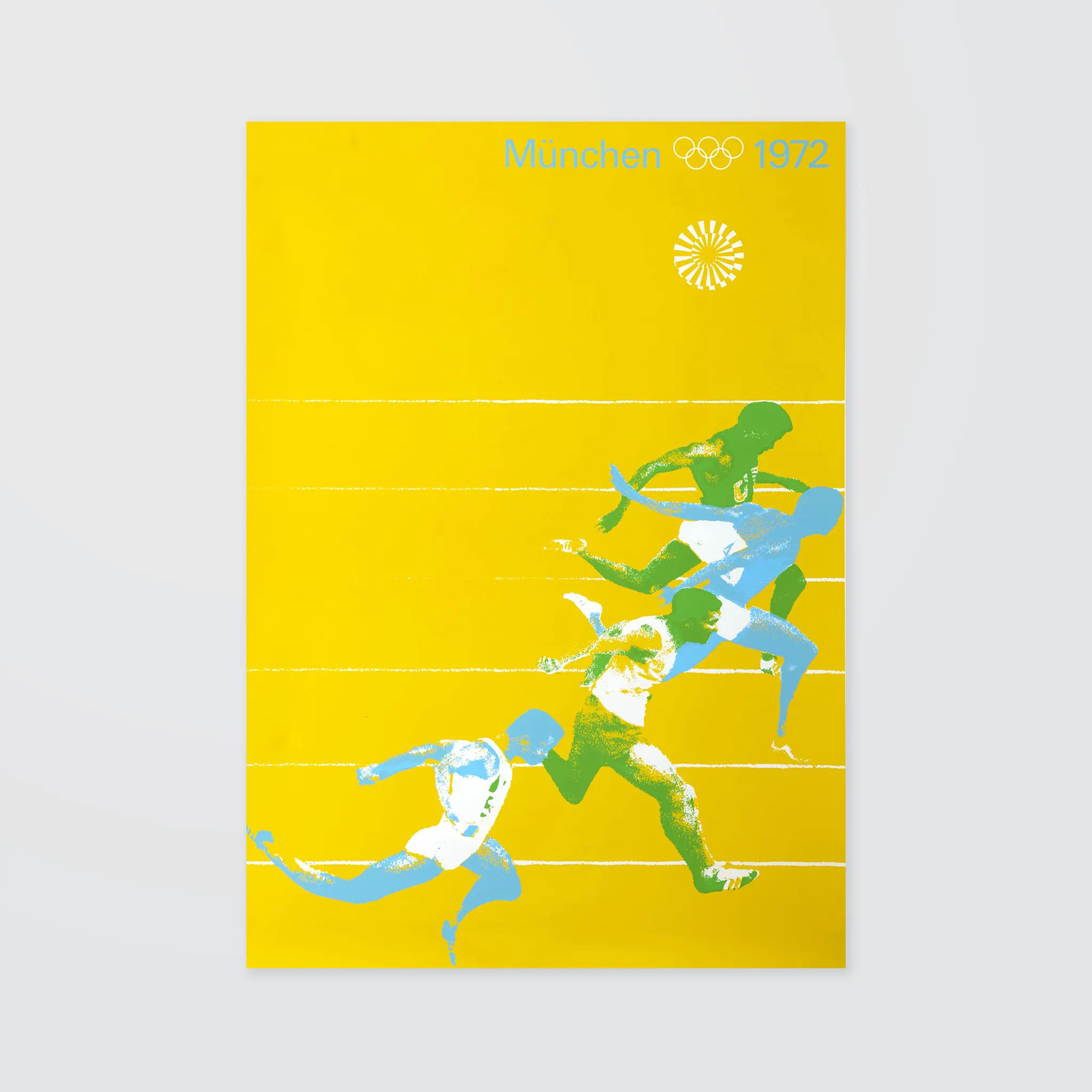
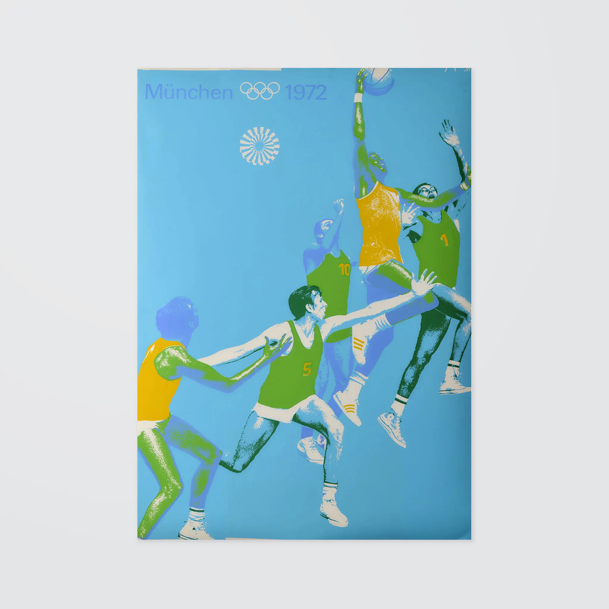
Posters were designed and produced for each sports discipline in which contests were held at Munich 1972 - twenty one in total. The sports posters were intended to fulfil the following requirements:
– They should be intelligible in a majority of international cultures;
– They should appeal to most people throughout the whole world. This basic conception was met by the tendency to favor photography of sports events as opposed to other forms of illustrations. Thus the goal of the Munich conception was to intensify the meaning of photography and its value as a signal for the purpose of information on the Olympic Games in Munich as expressed in form and color over and beyond the use of the emblem. Therefore, great care was taken to select typical athletic situations as photographic models. The abstraction and simplification of form and color were the means to this end. This process defined the symbolic character, allowed secondary features to vanish and kept the essential features.
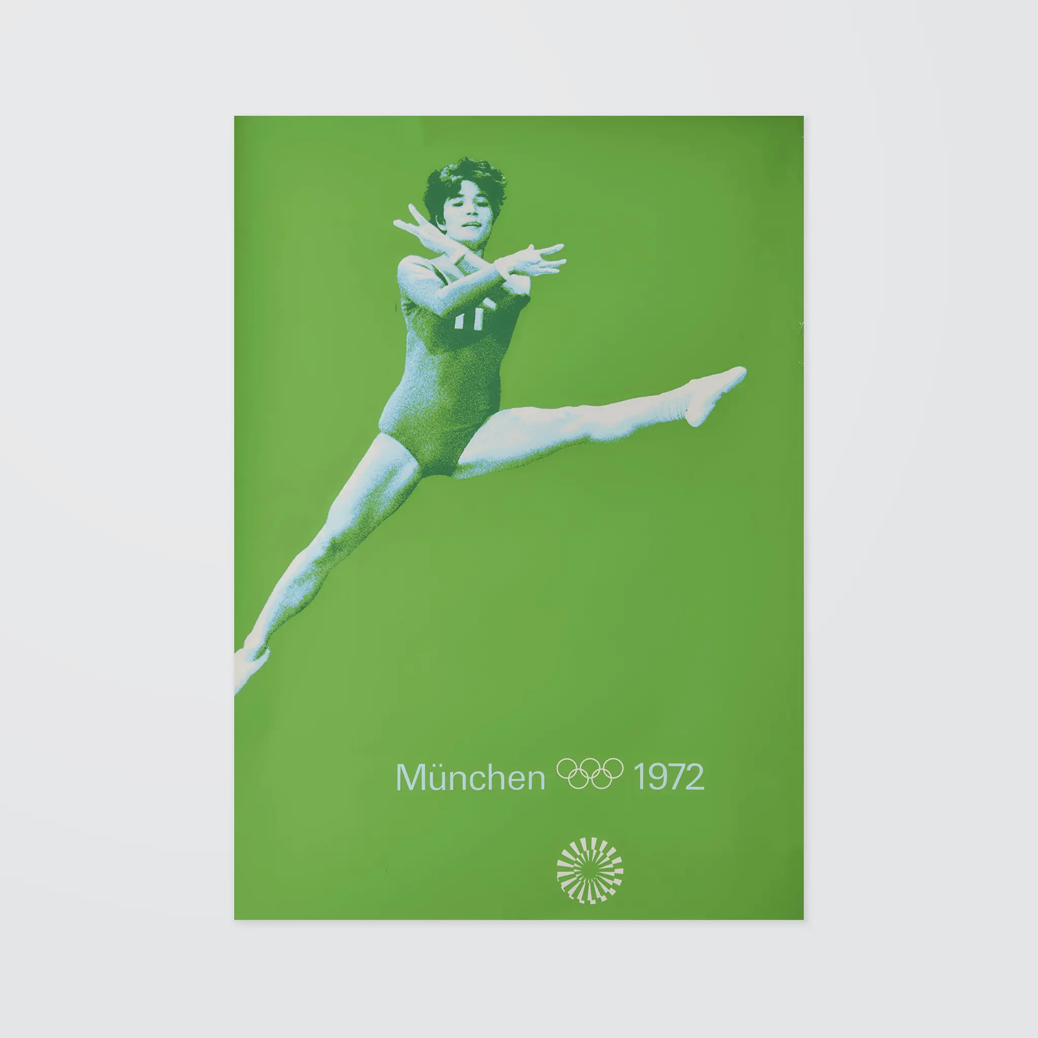
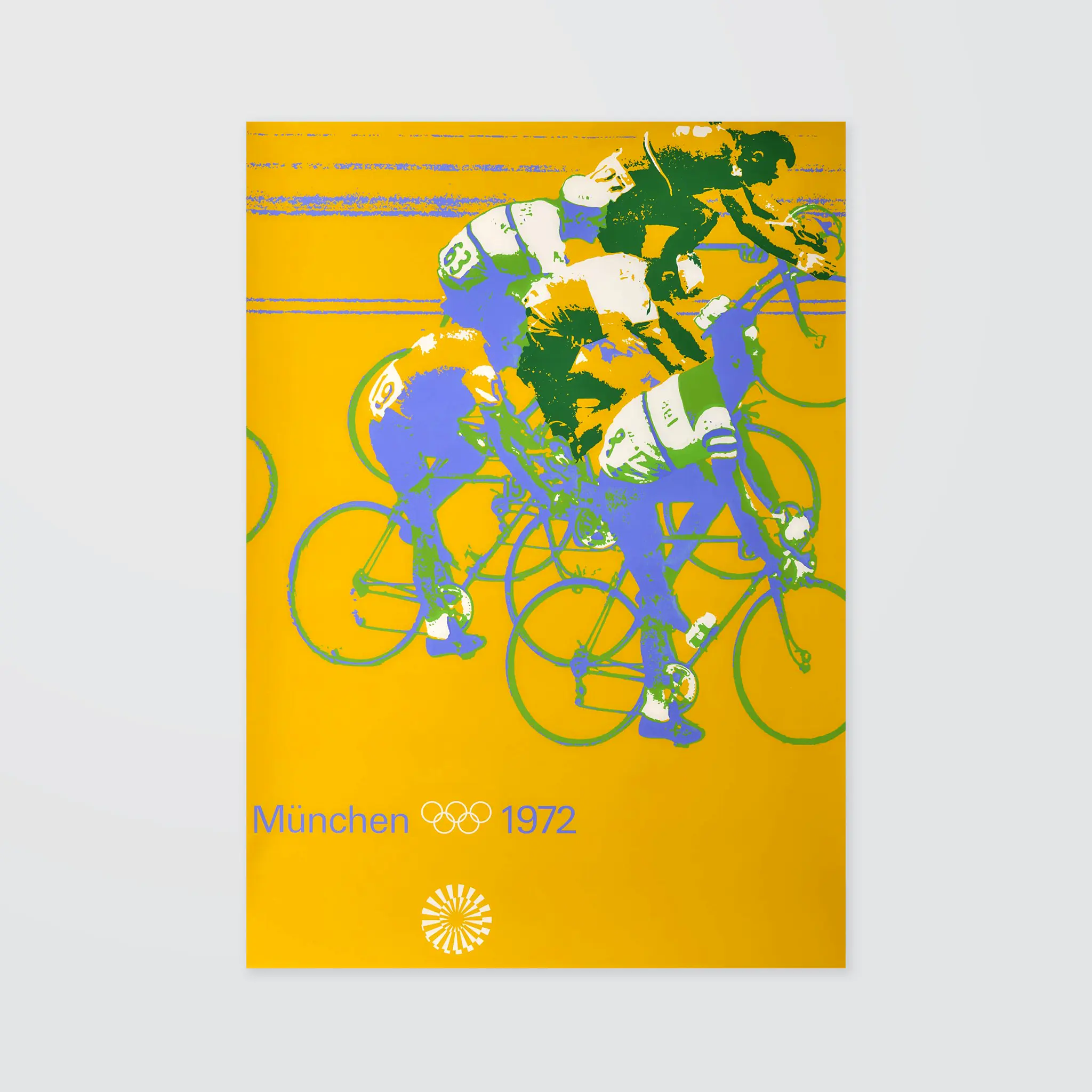
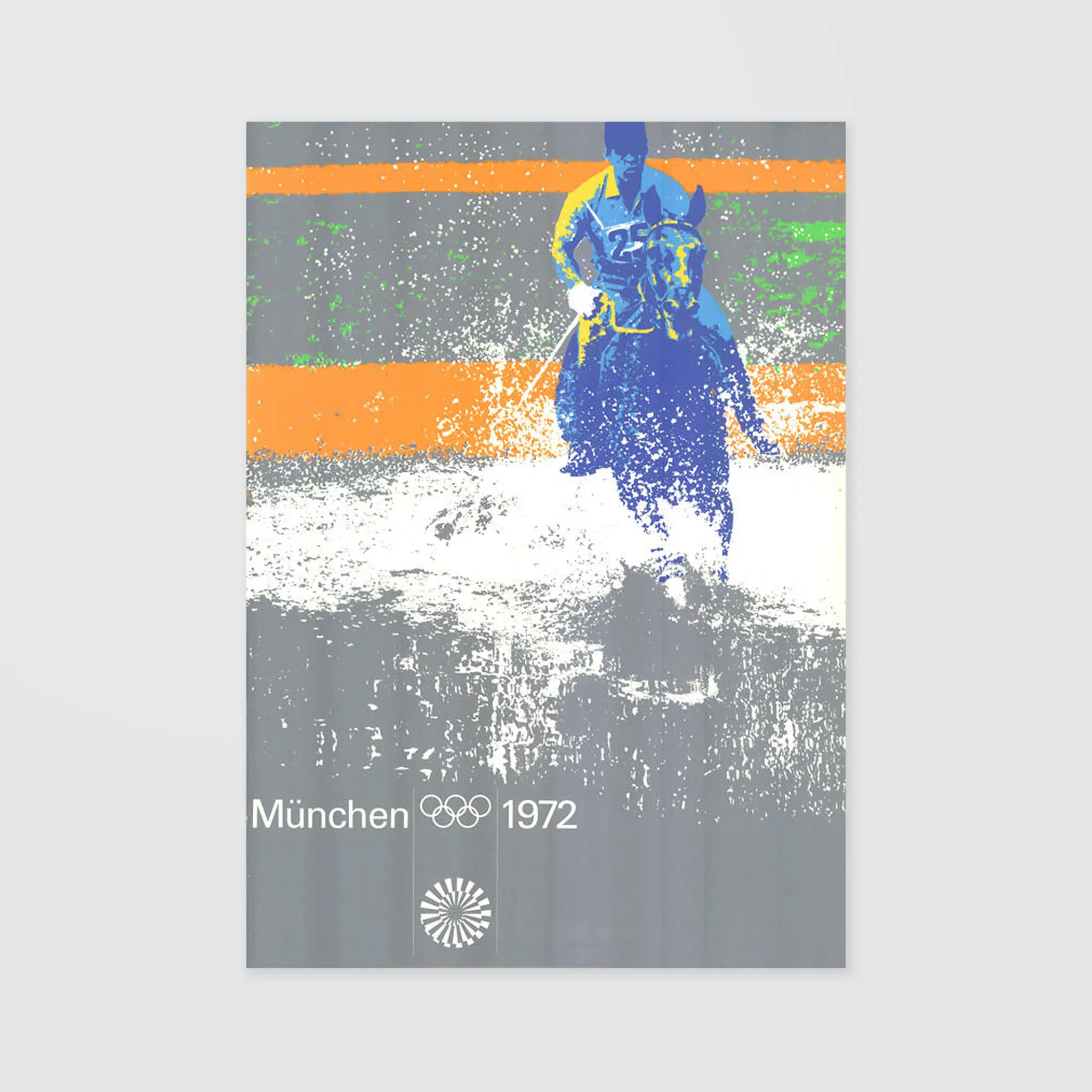
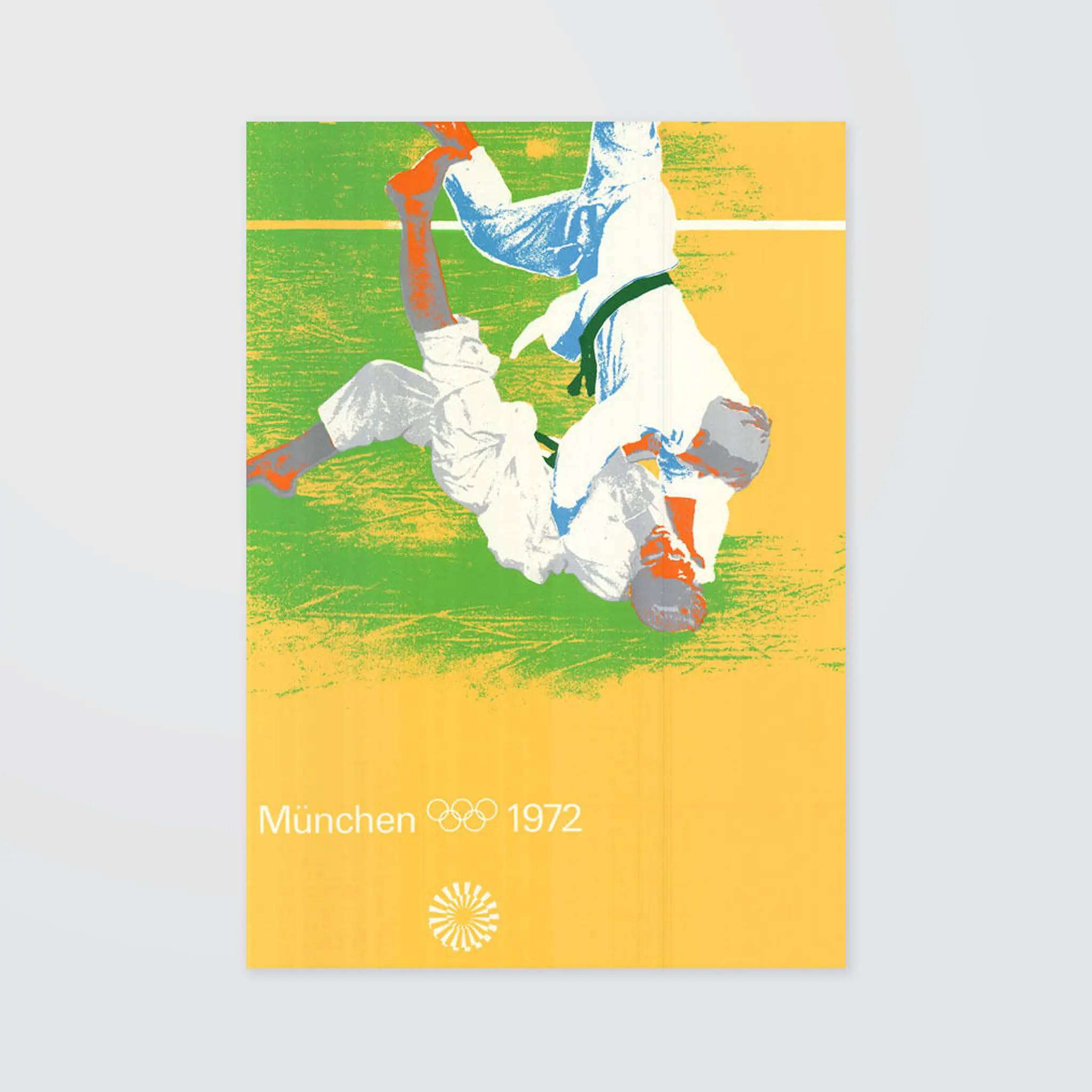
Lots of colour combinations and even alternative images for some of the sports were produced by Gerhard Joksch and his team. Accustomed color associations were replaced by surprisingly new color values and combinations. Applied on either large areas or piecemeal they signified the typical atmosphere of each sport: the refreshing water, the expanse of the football field, the island of a fencing bout — despite every deviation from naturalistic depiction. Die Spiele - The official report of the Organising Committee for the Games of the XXth Olympiad Munich 1972, pro Sport München
So far, I've found reference to around 85 of the test prints, here's a selection...
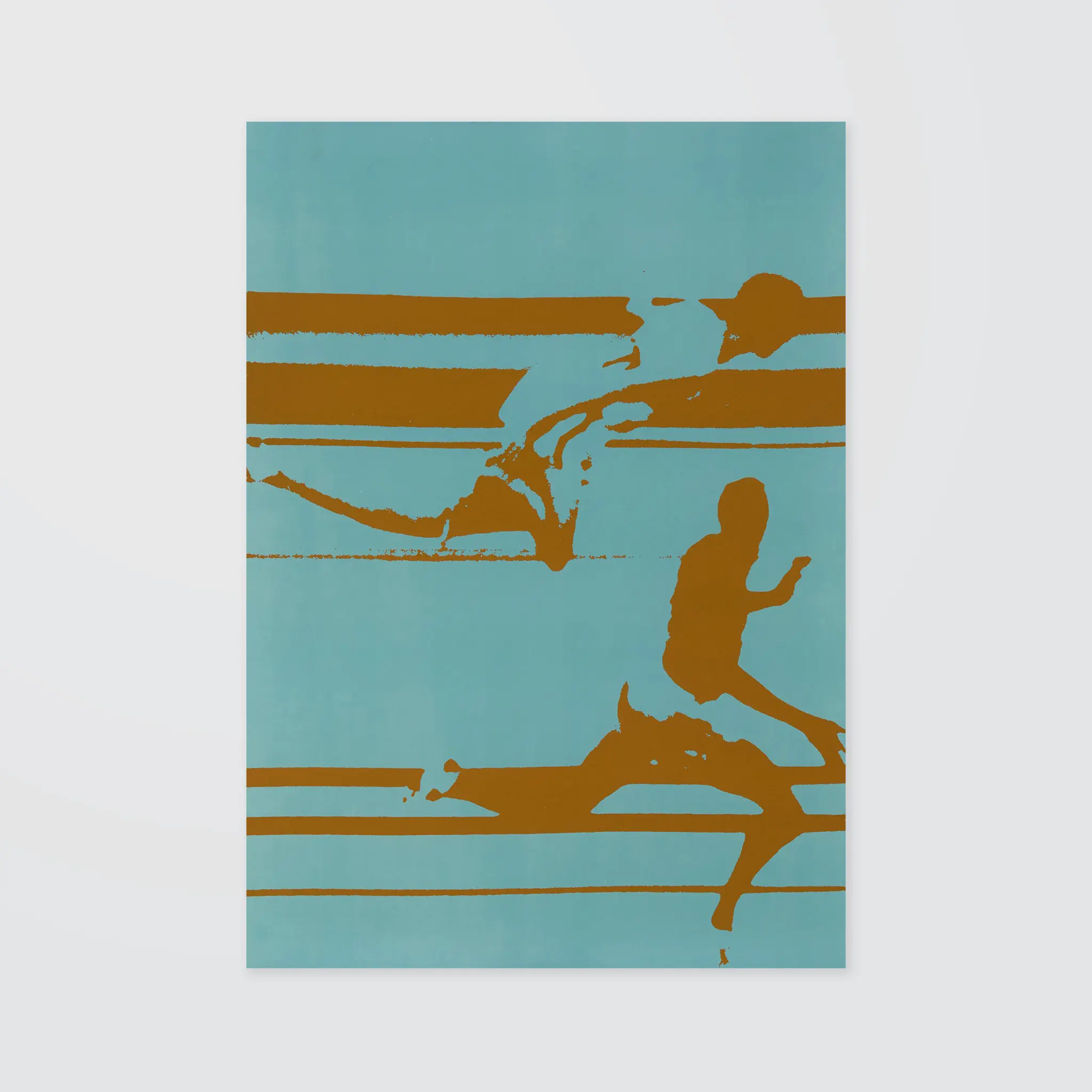
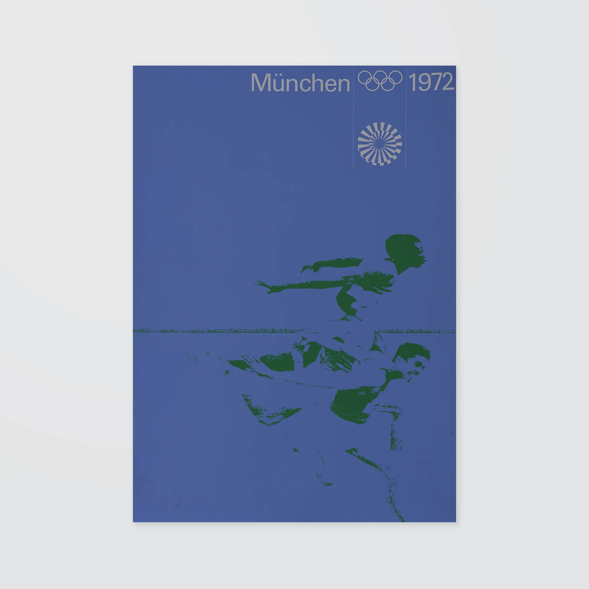
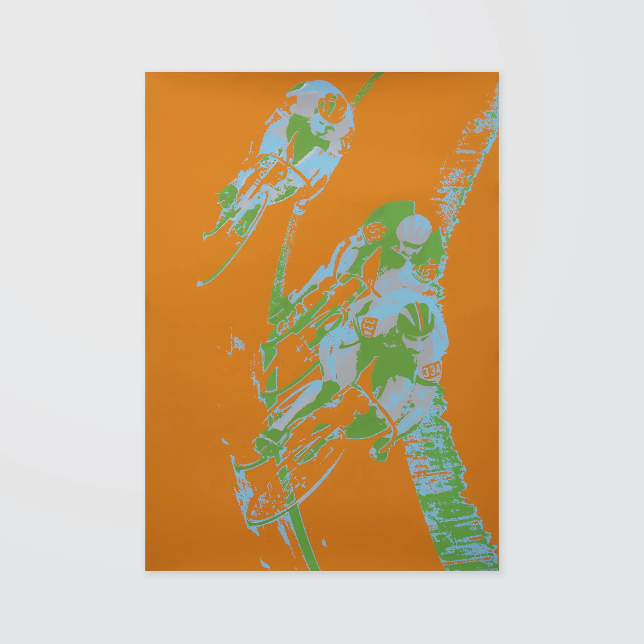
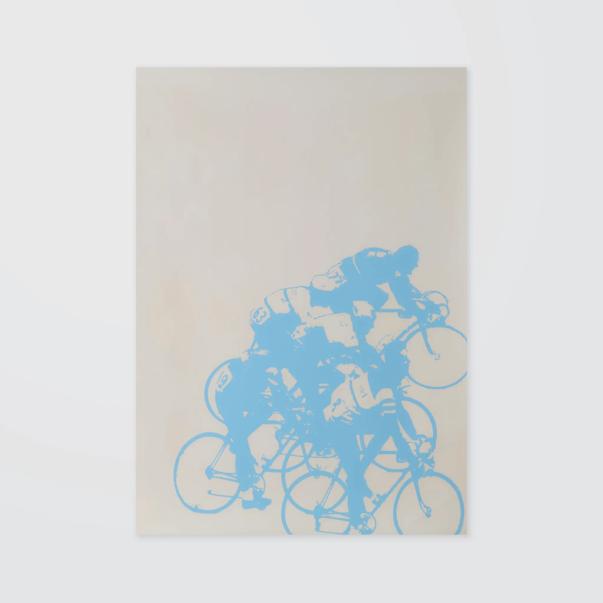
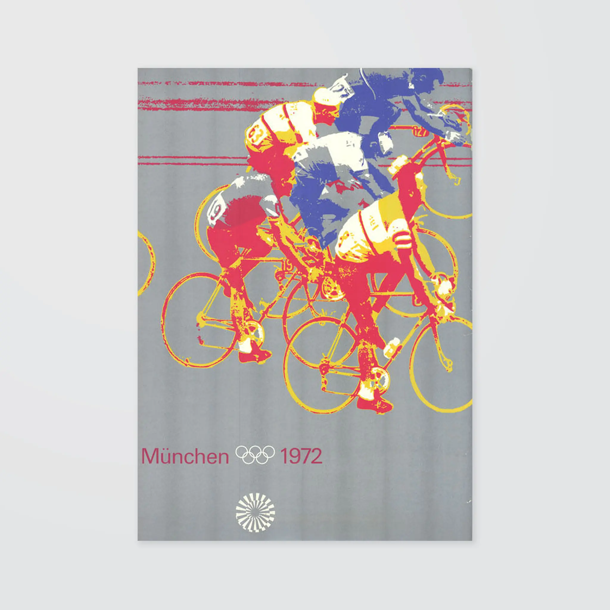
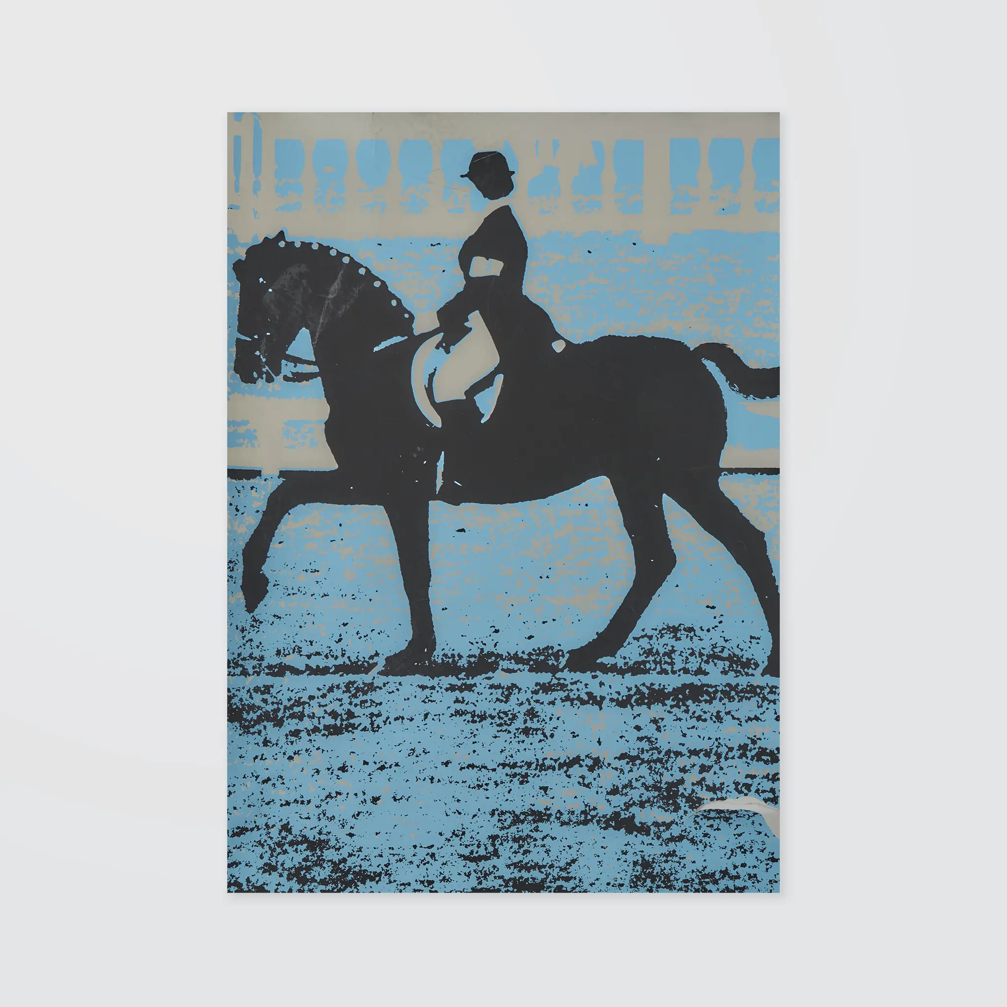
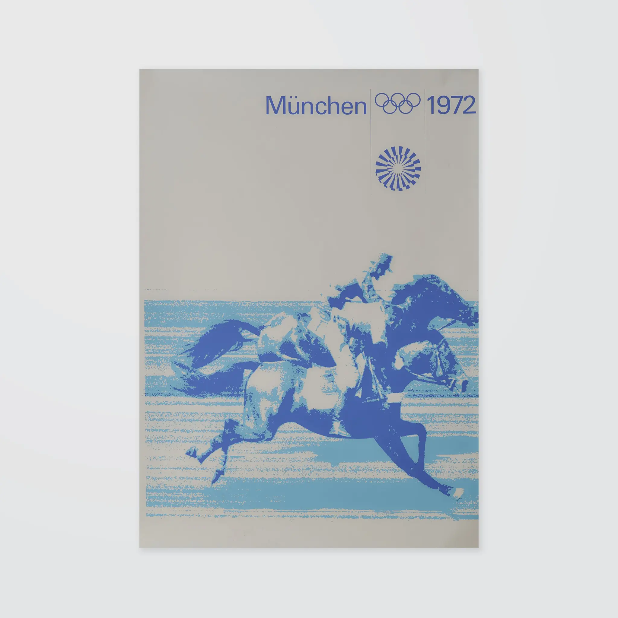
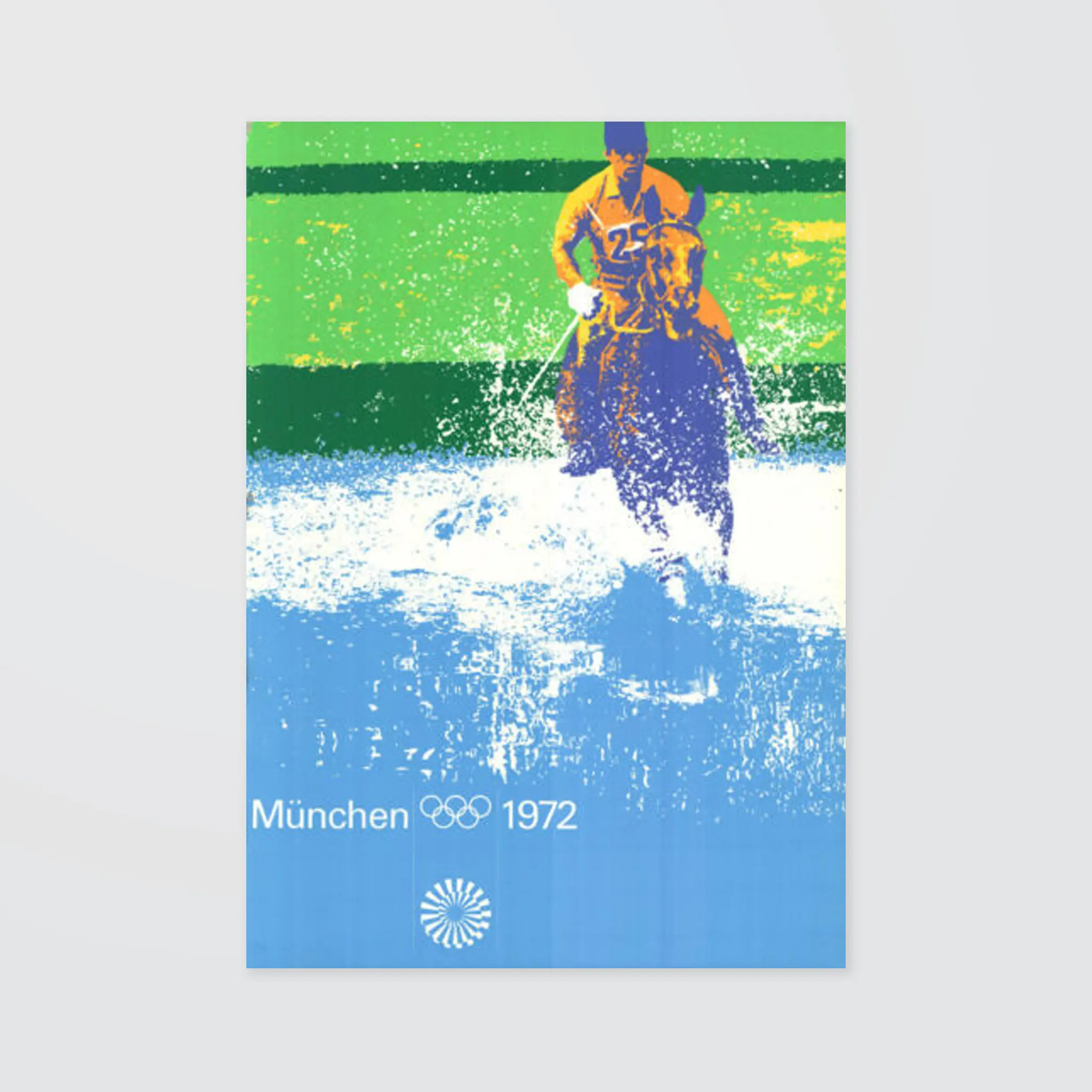
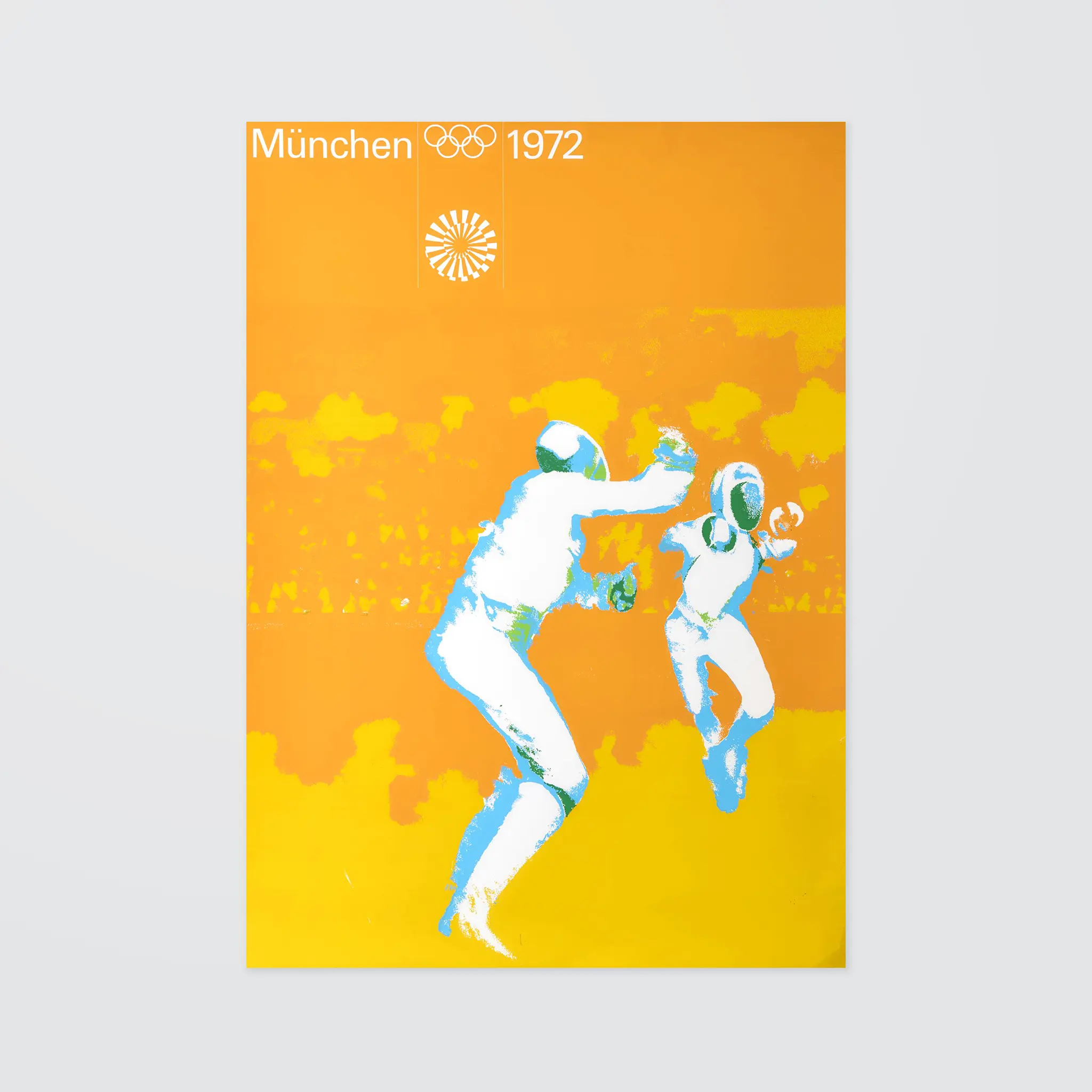
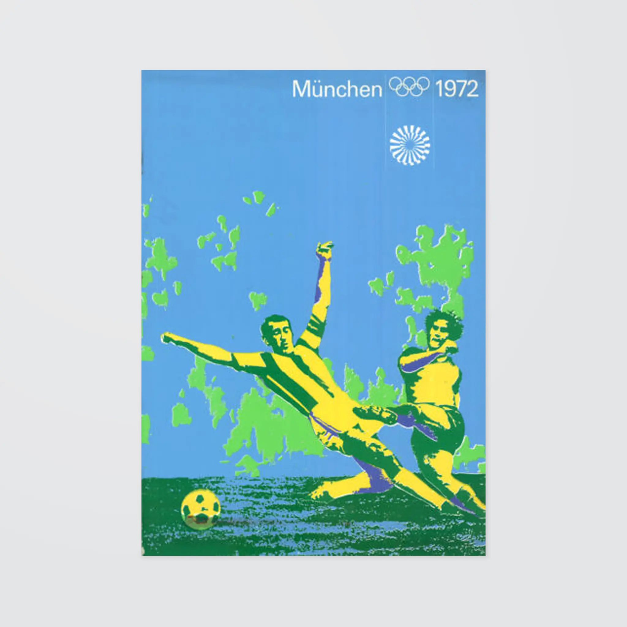
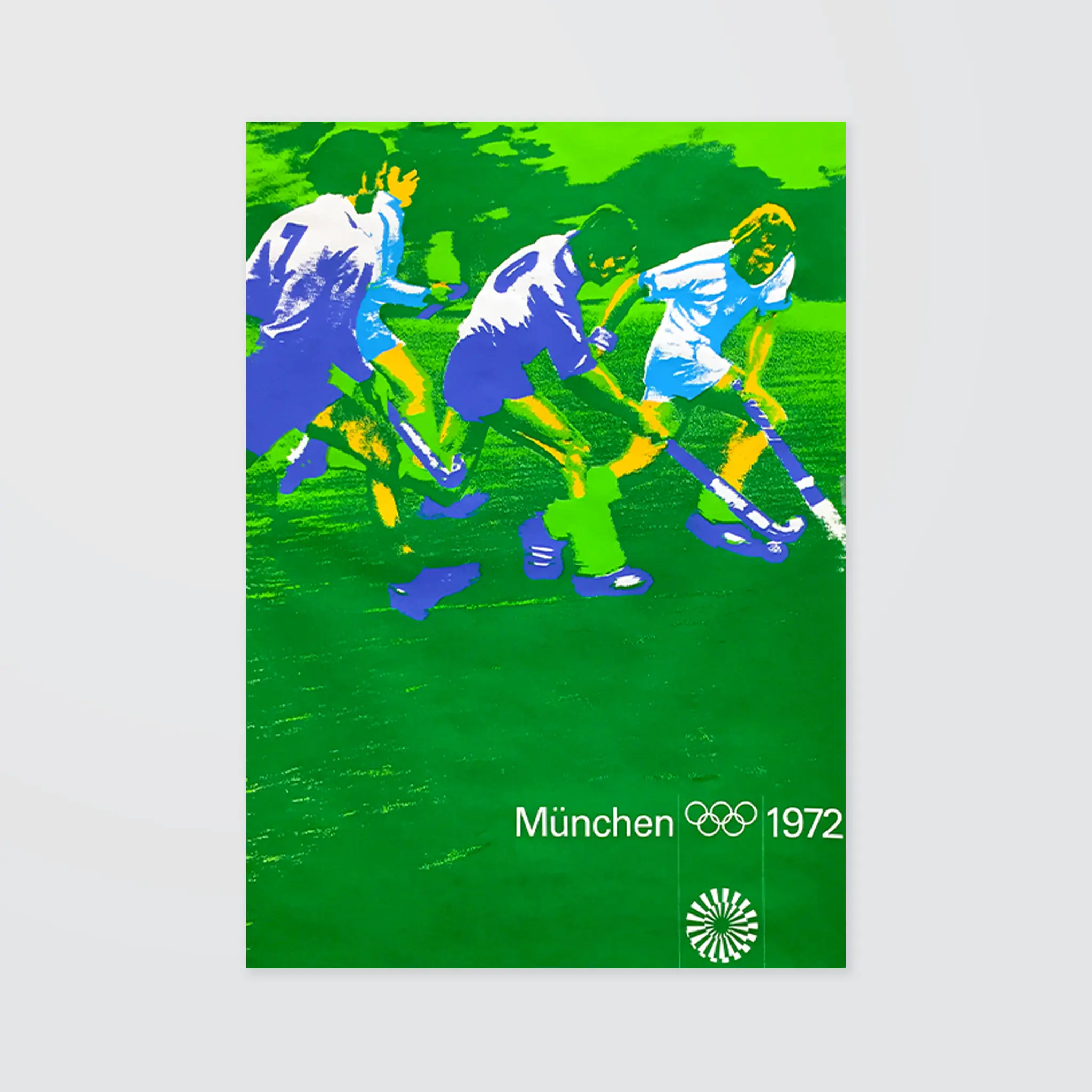
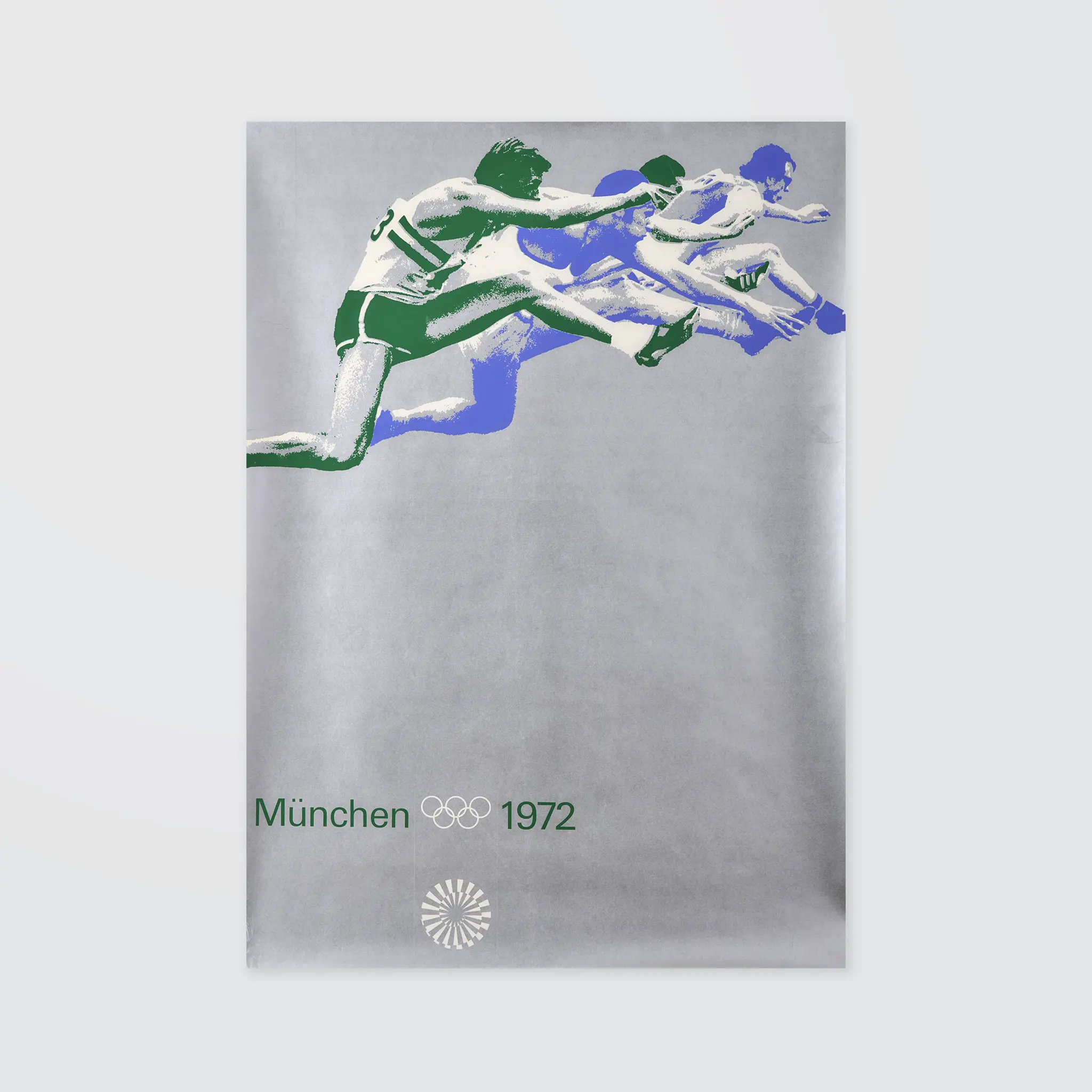
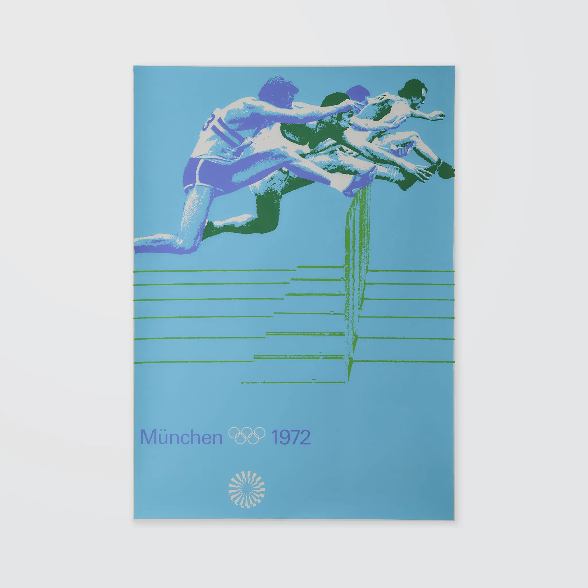

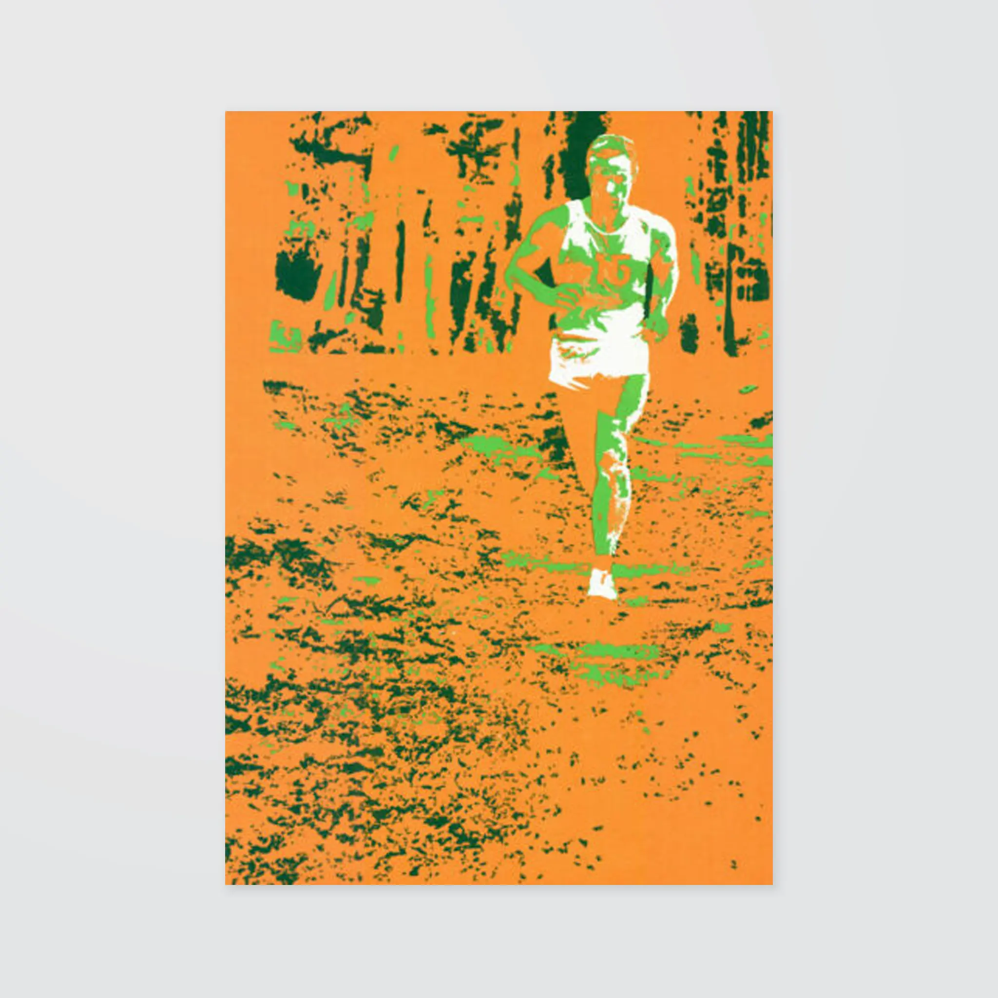
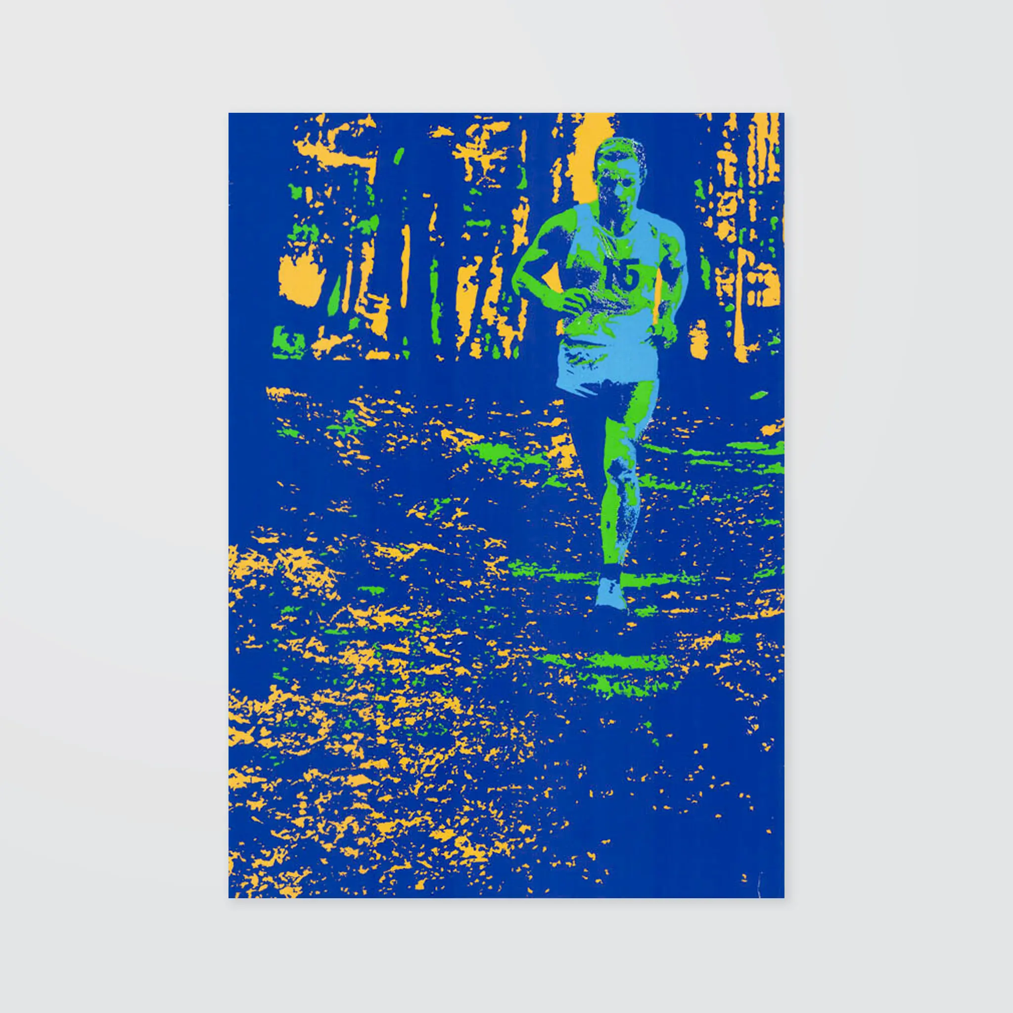
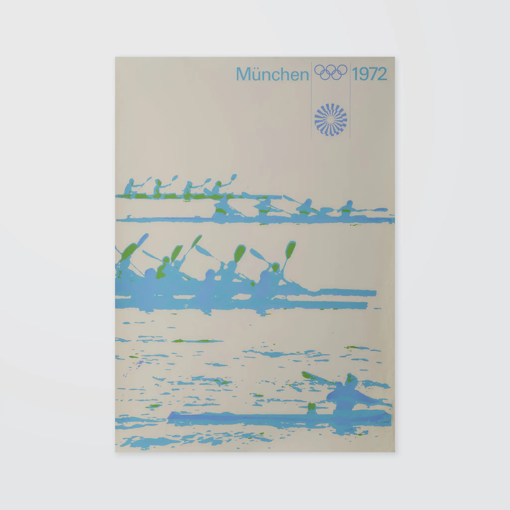
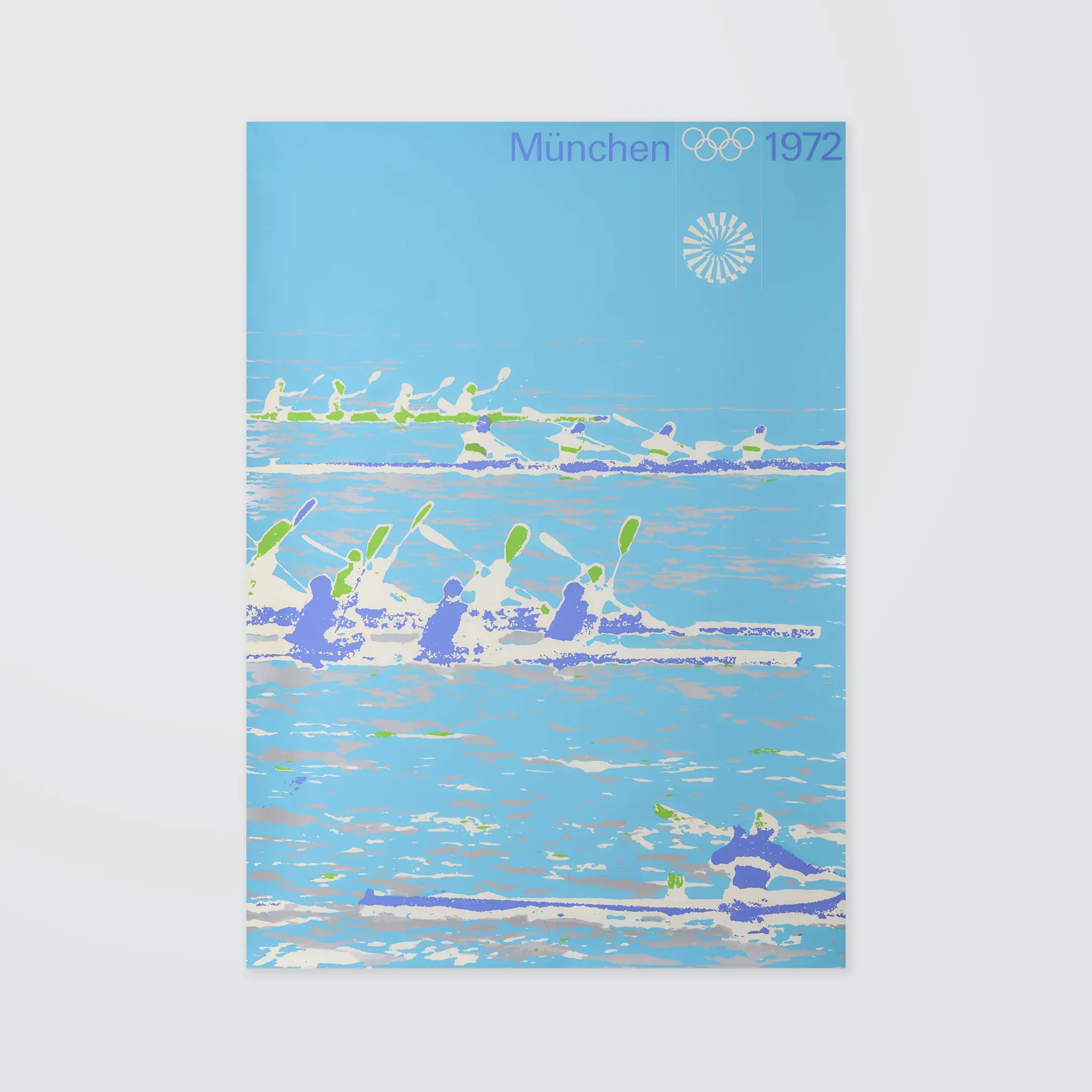
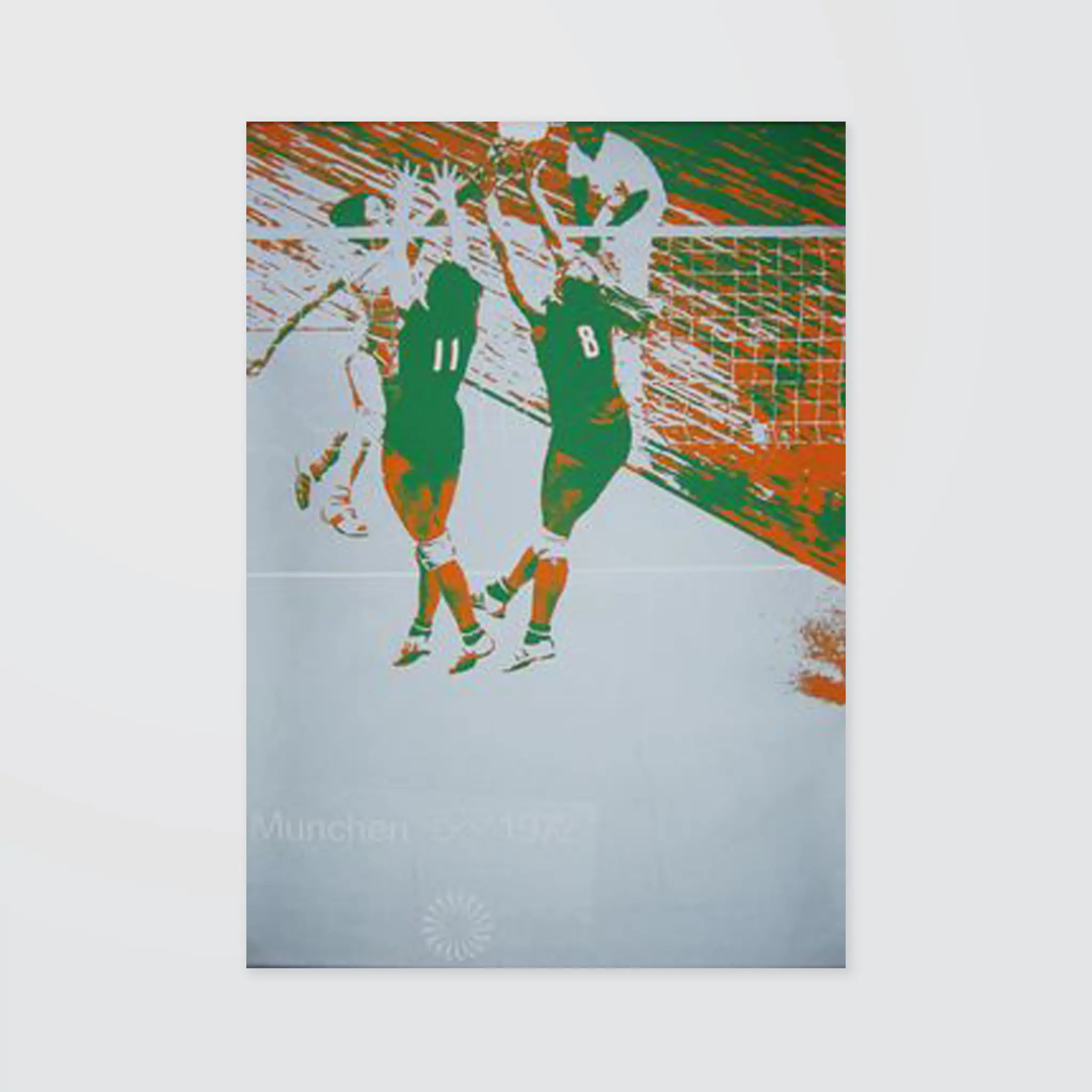
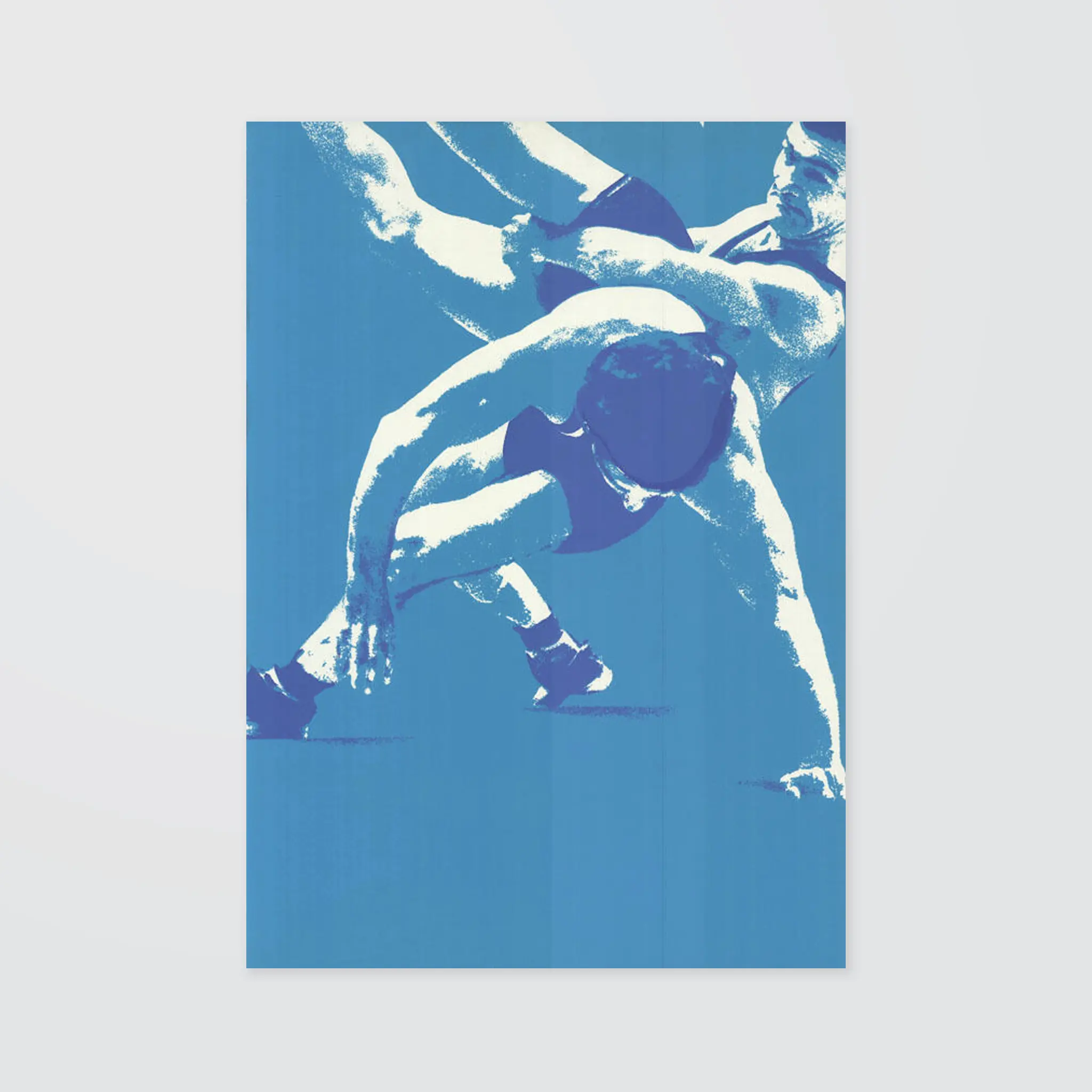
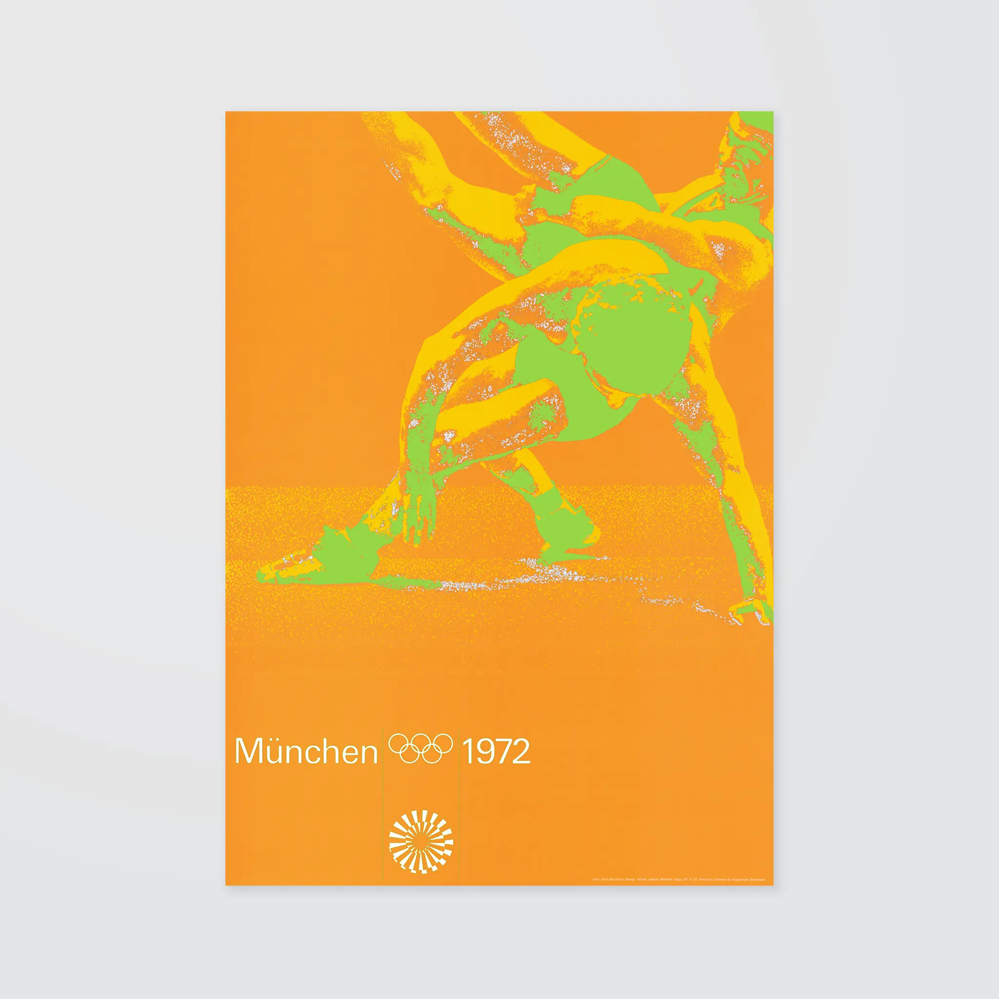
All the posters were screen-printed and therefore expensive to produce so in the end silver was used sparingly, though there was no limited on the number of ink colours used in general.
"Each sports poster had its own colour; each poster had a colour code. The colours were printed as solids, partly next to each other or over each other so that an interesting colour impression arose. Through the consistent use of all the Olympic 'Aicher colours' we developed a routine. They were the most expensive posters I was ever allowed to design in my work, and we were not given any rules for the number of ink colours for each poster".
- Gerhard Joksch, Project leader for the sports posters.
Munich '72 The Visual Output of Otl Aicher's Dept. XI, Mark Holt